Brandmark
Last updated:
21 July 2025
Role of our brandmark
Our brandmark is a visual identifier for UAL, connecting us to the idea or message you are communicating.
Whilst our logo is used to help people recognise something, like a piece of communications, as coming from UAL, our brandmark is a visual symbol that instantly connects audiences with our brand, even when separated from our name.
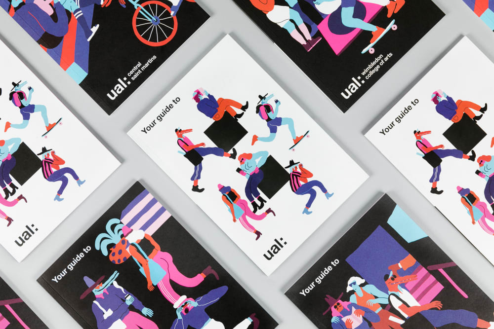
Using our brandmark
The brandmark is a playful element that can be used in a variety of ways:
- Make sure the brandmark is recognisable as a colon. Don't distort, duplicate or rotate it.
- Don't use the brandmark multiple times within an application.
- If bleeding the brandmark off the format, make sure this is no more than half its width.
- Don't use the brandmark as a logo to represent projects, programmes or specific business units.

Using our brandmark with typography
The brandmark can be used with typography alongside one statement, headings and multiple copylines:
- Make sure sentence case is used for messaging.
- Where possible, make sure the brandmark aligns with the typography and/or logo.
- Make sure the brandmark doesn't look like bullet points when aligned with typography.

Scale
The brandmark references the colon in our logo, but with a different ratio:
- It has been created with 2 perfect squares, separated by the negative space of one of these squares.

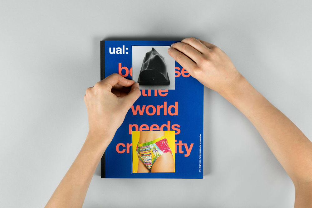
Colour
The colour of the brandmark and its background are flexible:
- Use our primary colour palette and up to 2 of our secondary colours.
- When choosing colours, consider contrast between the brandmark and background.

Positioning and layout
The layout and positioning of our brandmark is flexible:
- Scale our brandmark relative to the format and content.
- When using the brandmark with imagery, ensure there is a relationship between them.
- Aim for a high contrast between the brandmark and background.